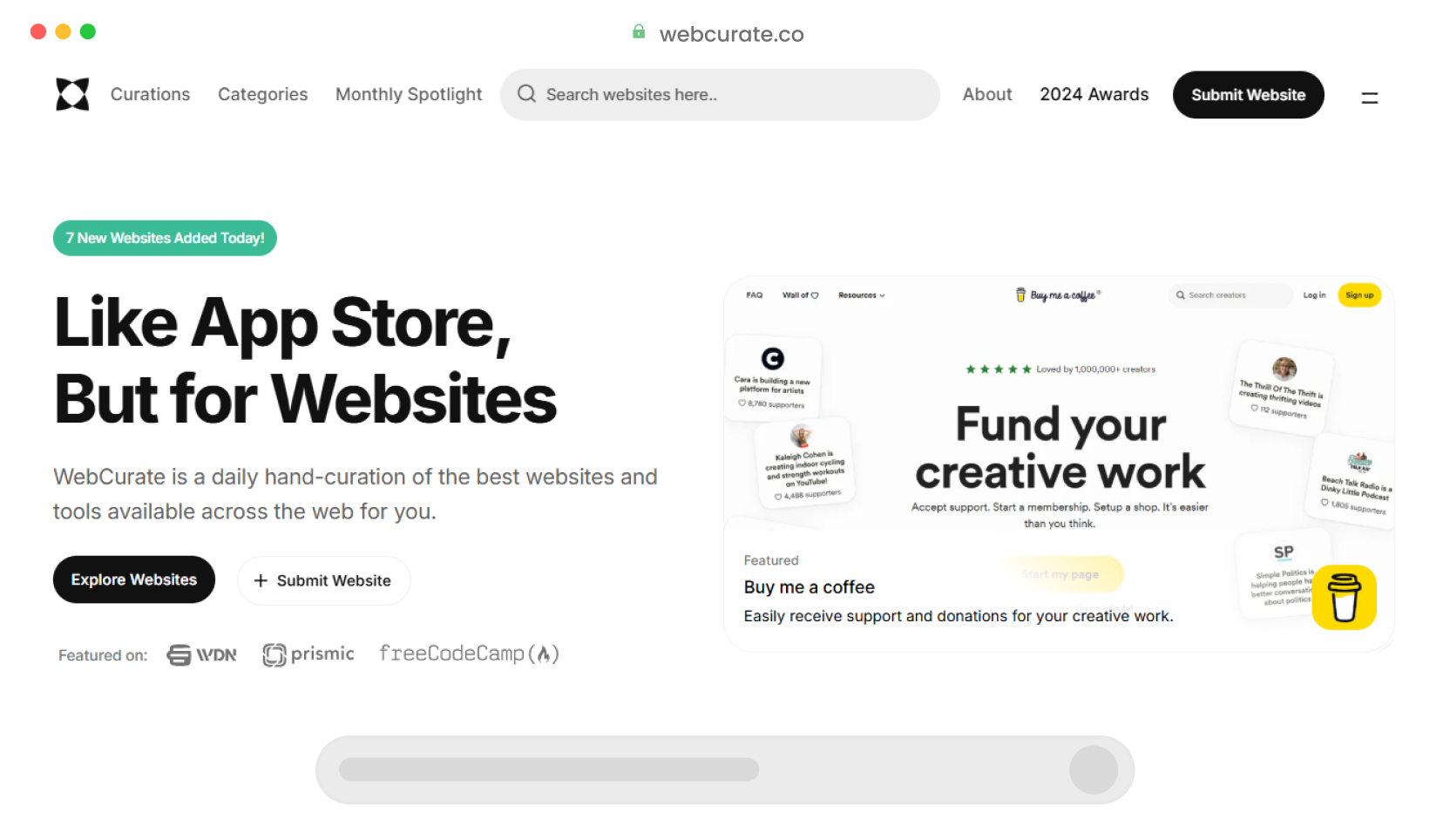
Explore the latest updates, improvements, and bug fixes with WebCurate Changelogs.
UI polished and enhancements.
We have dedicated time to refining our main page, incorporating minor UI improvements to create a more polished and user-friendly experience. Enjoy a sleeker interface and enhanced navigation for an even better experience.
Revamped the Monthly Spotlight section.
Our Monthly Spotlight section has received a major upgrade. With new algorithm updates and filtering capabilities, you can now explore our top-rated websites from previous months and years.
Added Popular Categories section to our feed page.
Our feed page now highlights our most popular categories and the number of websites in each, making it easier than ever to find the content you love.
Popular categories now feature our most highly-regarded selections.
As you browse popular categories, you'll now see a clear outline of our best-curated selections, making it easier for you to spot the best in each category and enjoy the most relevant content.
Updated product assets and removed broken links.
During our recent archive review, we updated product listings with fresh assets, including logos and screenshots. Additionally, we've streamlined our archive by removing websites that have been discontinued and eliminating any duplicate entries.
Added more highlight badges to product cards.
To make it easier for you to find exceptional products, we've included additional highlight badges on the product cards, including Popular, Editors' Choice, Spotlight, and Trending.
Added website direct links to product cards.
You can now easily explore any product website by clicking the direct link button on its product card. No need to anymore visit the product page first!
Revamped the Main page.
We've transformed our main page layout for a more engaging and informative experience. Rather than featuring only 2 sections like before, you can now see samples of all our main sections on the main page, with the option to load more on the page itself.
Added new sections: Free Products, Editors' Choice and Monthly Spotlight.
You can now easily access our collection of the best free products and free plan products all in one place under the "Free Products" section. In addition, we have added two other new sections called "Editors' Choice" and "Monthly Spotlight" to showcase our favorite products from the best available options, as well as to feature a monthly roundup of our most popular products.
Polished UI and fixed other minor UX issues.
Sharp eyes will spot the upgrade! We've bolded related categories for a more dynamic browsing experience. Plus, we've also addressed some minor UI and UX usability issues to create a smoother flow.
Revamped the Product page.
We've revamped the product page layout to make it more engaging and informative. Now, you'll see a clear icon of the product you're viewing, along with its title and tagline. Plus, a handy sidebar keeps you browsing with featured and latest products, and trending categories to discover even more.
Added Feedback widget.
We're excited to announce a new way to hear from you! We've added a Feedback widget that makes it easier than ever to share your thoughts and suggestions. Let us know what you like, what could be improved, or any ideas you have - your feedback helps us make things even better!
Minor UI Updates.
We've been busy making things a bit smoother! We've implemented some minor UI improvements to make your experience even better. Enjoy a cleaner interface and easier navigation.
Added filter and sort options for categories.
To simplify your navigation and make finding things even easier, we've added filters and sorting options to the category pages. You can now narrow the results based on them being Premium or Resource and sort them based on their popularity and recency.
Added Random Product button on search bar.
We've added a "Random Product" button to the search bar. Click it to explore a surprising item from our curations. Plus, for faster access, you can now use the keyboard shortcut Ctrl K to activate the search bar.
Polished UI and fixed other minor UX issues.
We've ironed out some minor kinks in the website and mobile view design, making things run even better. Plus, your browsing experience will now match your device's theme, for a seamless look!
Removed duplicate products and outdated curations.
We've removed some duplicate products that accidentally got listed twice. We've also gotten rid of some older items that aren't quite up to our standards anymore. This means you'll find a cleaner selection of high-quality products to choose from.
Improved the UI of product display.
To make things clearer with the new "quick facts," we've given the product rows a fresh look. They're now cleaner and less cluttered, and each product has its own icon to help you recognize it at a glance.
Added "Discover" section.
Our new "Discover" section shows curated lists of top tools and products from our archives. Every time you refresh, a new selection pops up, giving you a chance to find awesome stuff you might have missed before.
Revamped the Categories page.
Get to what you're looking for faster! Our categories page has been completely overhauled. Now, simply hover over "Categories" in the navigation bar to see a dropdown menu with all the main categories. Each main category even shows its sub-categories, so finding what you want is super easy!
Categorized Products menu in nav bar.
The products menu in the navigation is now categorized into 3 subsections under a dropdown menu; Recent Products, Premium Products, and a newly added section Discover, where you can explore useful products and tools from our past curations.
Added quick facts to tools.
All new tools will now contain quick facts to help you get a quick overview of the standout features of a particular tool.
UI polish and bug fixes.
Removed the unnecessary suggestion of the searched category on the category page. Hid the inapplicable save button on hover in mobile view. Moreover, we've polished the UI of the footer, dark mode and a few other places.
Added Collections page.
With Collections, you can save your favorite tools and products in one place for later convenient reference.
Enabled Multi-language support.
We've added multi-language support to our website. You can now navigate it in Chinese (Simplified Chinese), Deutsch, Español, Français, and Português (Brasil).
Added Dark mode.
We've added Dark Mode! Now you can switch your view to a darker theme that reduces eye strain and battery consumption, especially in low-light environments.
UI polished and enhancements.
Polished the UI on the main page and other sections of the site.
Added Changelog.
Implemented a changelog page to inform users about the latest updates, improvements, and bug fixes.