

 EDITORS' CHOICE
 Mobile Simulator
EDITORS' CHOICETest your mobile responsive websites with realistic simulators.
Try Mobile Simulator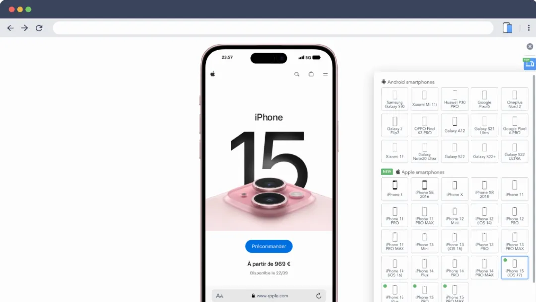
What is Mobile Simulator?
Try Mobile SimulatorMobile Simulator is a powerful Chrome extension that allows you to test the responsiveness of your mobile websites. It provides a collection of realistic simulators for various smartphone and tablet models, allowing you to see how your website appears on different devices and resolutions.
Features:
- Wide Device Range: Choose from 55 devices, including recent and old Android and Apple smartphones, tablets, and special devices like Apple Watch and Macbook.
- Video Captures: Easily create video captures of your website in WEBM, GIF, or MP4 format.
- Screenshots: Capture transparent PNG screenshots of smartphone views for use in emails, presentations, and more.
- Night Mode: Test your website's appearance in dark mode.
Use Cases:
- Web Developers: Test the responsiveness of your mobile websites on different devices and resolutions, ensuring a consistent user experience.
- Designers: Evaluate the visual appearance and layout of your website across various mobile devices.
- Marketers: Showcase your mobile website's responsiveness to clients or stakeholders.
- Presentations and Emails: Capture screenshots of smartphone views to include in presentations, emails, or other communications.
Published on Jun. 20, 2024