WindUI
TRENDINGAccess a collection of expertly made, and free UI Components for your Tailwind CSS projects.
Try WindUI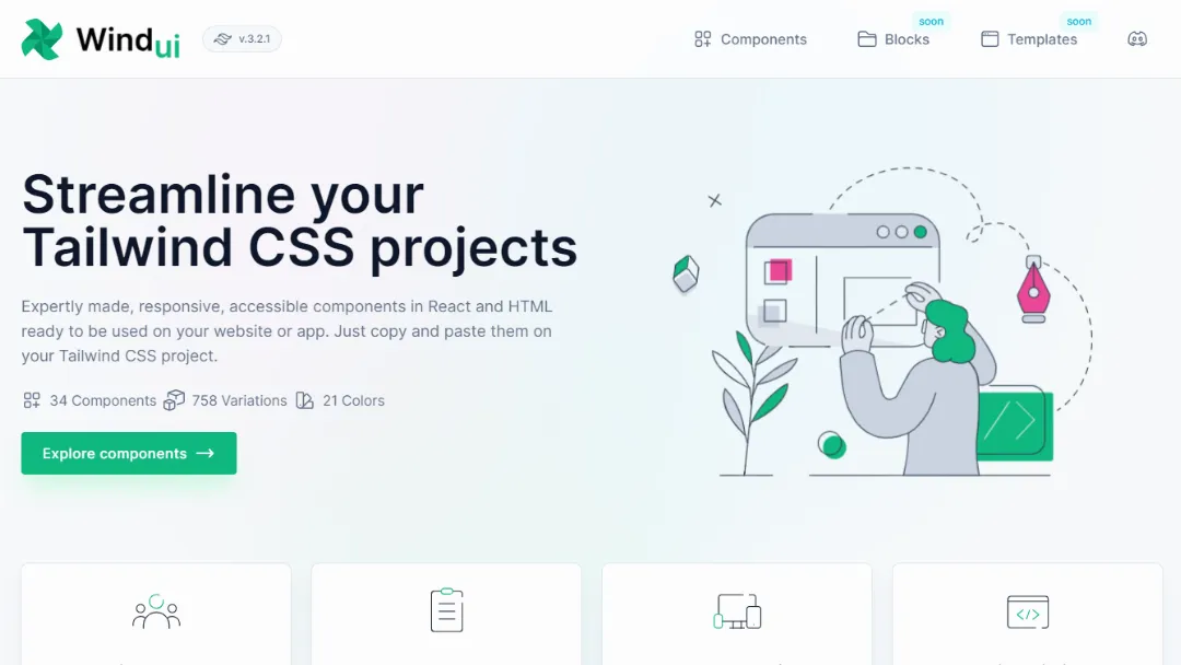
What is WindUI?
Try WindUIWindUI is a comprehensive Tailwind CSS component library designed to streamline the development process by providing expertly crafted, responsive, and accessible UI components. Ideal for developers and designers, WindUI allows users to quickly implement pre-built components in both React and HTML formats.
Features:
- Extensive Component Library: 42 components available, including buttons, cards, modals, and more.
- Variations: Over 950 variations to choose from, allowing for customization to fit different design needs.
- Color Options: 21 color choices for each component to suit various branding requirements.
- Accessibility Compliance: All components are built with proper WAI-ARIA attributes for full accessibility.
- Responsive Design: Components are fully responsive, ensuring they look great on any device.
- Vanilla Tailwind: Code is in its original form, requiring no additional dependencies or customizations.
- Easy Implementation: Components can be easily copied and pasted directly into projects.
Use Cases:
- Web Development: Quickly scaffold user interfaces for websites or web applications using pre-built components.
- Prototyping: Rapidly create prototypes for client presentations or internal projects.
- UI Design: Leverage the Figma design library for visual design work alongside the component library.
- Responsive Applications: Build responsive applications that provide a seamless experience across devices.
- Accessible Interfaces: Ensure your applications are accessible to all users, including those with disabilities.
- Styling Consistency: Maintain a consistent design language across your projects without extensive styling work.
Published on Oct. 13, 2024

