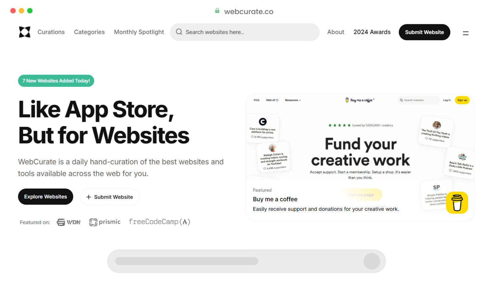
Discover our selection of the best UI component libraries and search above for even more handpicked resources.
Accelerate your React development with visual, intuitive superpowers.
Speed up your web development with Svelte UI widgets: Gantt, DataGrid, and more!
Develop your website fast with a set of open-source and customizable component library.
Open-Source UI elements made with CSS and HTML
UI components, brand guidelines, brand assets, code snippets and developer guidelines for Marvel products.
Set of Lightview and fully customizable Vue Components optimized for TailwindCSS.
A Vue 3 Component Library. Fairly Complete. Customizable Themes. Uses TypeScript.
A lightweight, customizable Vue UI library for mobile web apps.
Easily build high-performance cordova hybrid mobile apps and PWA using large set of Vue components.
An intuitive UI Components library for building high-quality, developer-friendly, configurable, and accessible Vue.js Design Systems.
Low level component library for building accessible high level UI libraries, design systems and applications with React.
A collection of components that will reliably help you build your application in a snap.
A React implementation of Spectrum, Adobe’s design system.
The ultimate collection of design-agnostic, flexible and accessible React UI Components.
A collection of free Tailwind CSS components that can be used in your next project.
A library of animations, sliders, tooltips, accordions, modals, and more!
One branded theme…all the frameworks! UI components that work in React, Vue 3, and Svelte.
A Tailwind plugin for building web applications. It has a set of accessible and reusable components commonly used in web applications.